THREE.IE SEARCH REDESIGN

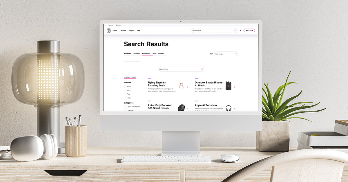
One of the most exciting projects I worked on recently was the redesign of the website header and search function on Three.ie across desktop, tablet and mobile.


Quick note — much of my work is protected property, so I must respect some restrictions. I will only be able to show designs which are live and in the public domain or that were discarded. I may also need to redact certain information. Thanks for understanding!


My brief could be summarised as follows


  1. Increase the prominence of site search on three.ie
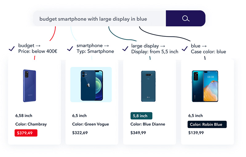
  2. Integrate Semantic Site Search technology


This meant that as well as visual upgrades, there would be a large functional overhaul of the site search backend — more on that shortly!

Historical Context


As you can see below, the site search function had remained a largely unchanged and a surprisingly insignificant part of the website design for many years. Search had become almost completely anonymous on desktop in early 2022.

Snapshot of the site search in 2014

Snapshot of the site search in 2022

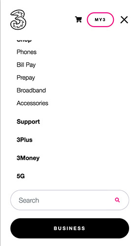
Mobile search in 2022 was more prominent, but slightly hidden in the menu.

The Business CTA was also causing some confusion due to its proximity to the search field.

I believe the primary reason for this lack of prominence was that the search functionality was poor, simply displaying a list of hyperlinks, and therefore became less prominent over the years. Stakeholders didn’t want to let the feature go completely, but it definitely wasn’t fulfilling it’s function as well as it could either. I thought this was an interesting bit of psychology.

On the modern web the importance of a good search experience is significant. After all, users are already likely to have familiarity with platforms like Google which offer a great search experience. Users are therefore likely to have a high expectation from search functionality.


We noticed our search was underperforming. Realising the returned results were of poor quality, there was a definite need for improvement. I felt that if we could improve the experience and quality of results then we could also increase the prominence of the search function.


My role was understanding the technical requirements and designing solutions which featured the new search technology.


Three partnered with Zoovu to implement their Semantic Search product on the development side, while I would be in charge of the design and user experience.

Zoovu are specialists in content enrichment functionality

This meant that production would be split into 4 areas of responsibility


  1. Global website header UI/UX (myself)
  2. Site search UI/UX (myself)
  3. Website header development (Three developer)
  4. Site search development/embedding (Zoovu developer)


There would be some minor constraints in terms of what was possible to achieve, but for the large part I was given the freedom to design whatever I felt would work best making this a super exciting project.

MY DESIGN PROCESS

For the project I followed my own design process which aligns well with our approach internally


  1. Empathise
  2. Define Problems
  3. Research
  4. Design/Ideate/Prototype
  5. Build
  6. Test


I would be leading on the UX/UI side so would be responsible for the research phase and delivery of design. Inside our Agile Squad I would then support on dev handover, working closely with our in house team and the vendor to resolve any design snags. My next responsibility would be to assist our QA expert in their testing to flag any bugs which might related to design. Covering these areas would be really important to achieving a great search experience for users. I would be communicating with our in-house Product Owner at all stages.


There was a tight deadline for the project so the aim was to deliver a minimum viable product within 8 weeks. I designed the ideal experience for day one, but was also aware that some features may end up dropping into a separate bucket for version 2 if these couldn’t be built in time. In this case the project cycle and design process would restart shortly after the initial launch.

RESEARCH

I would need to do some research in order to decide the design approach. Our quantitative data included analytics reports and some depth interviews with our internal SEO expert, stakeholders and online surveys from users.

Product Investigation


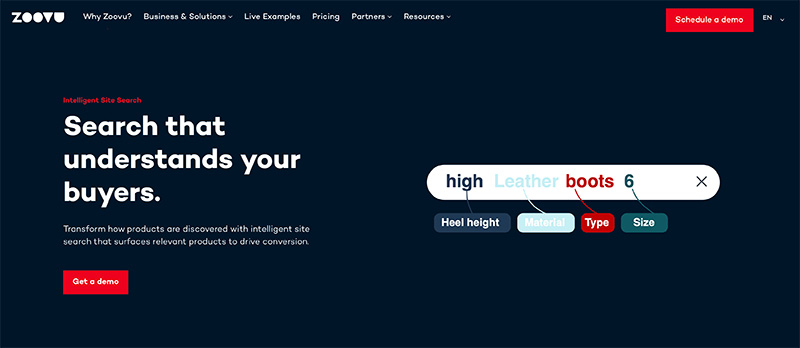
I started by investigating exactly what the Zoovu product was capable of. I didn’t want to design any pieces of functionality which would create risk around implementation.

Initially I reviewed their website and documentation. I later created initial designs and we discussed in short comments which would work and which might not. I also hosted live Teams sessions to go through some proposals in more detail.

Qualitative/Quantitative Data


I would need to also do some internal and external research in order to decide the design approach. Our data included Adobe Analytics reports, Hotjar Heatmaps, search reports and some depth interviews with our internal SEO expert, stakeholders and online surveys of users.

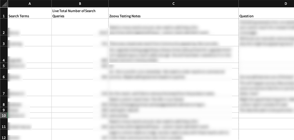
A search report (info redacted) which was very useful for gauging intent

Competitor Benchmarking


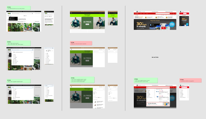
I also reviewed many competitor websites and websites of other industry leaders to get a steer in regards to best practice. I broke each of these down into sets of UX pros and cons. The results of this had a direct impact on my design direction.


I always find this kind of research useful because no matter how large your budget is, chances are there’s another company that has already built a similar solution with a budget that’s much bigger than your own. The budget doesn’t necessarily need to be financial either, they could simply have the luxury of time whereby they’ve spend months or sometimes years developing the UX.

After reviewing well over a hundred websites, here’s some examples I found to be among the best.

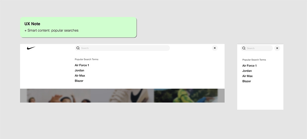
Nike Search

Nike had an elegant solution which included search suggestions

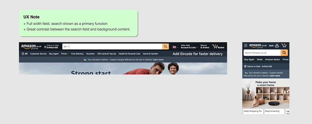
Amazon Search

Amazon search gives a sense of prominence by leveraging clever use of contrast

Bulk Search

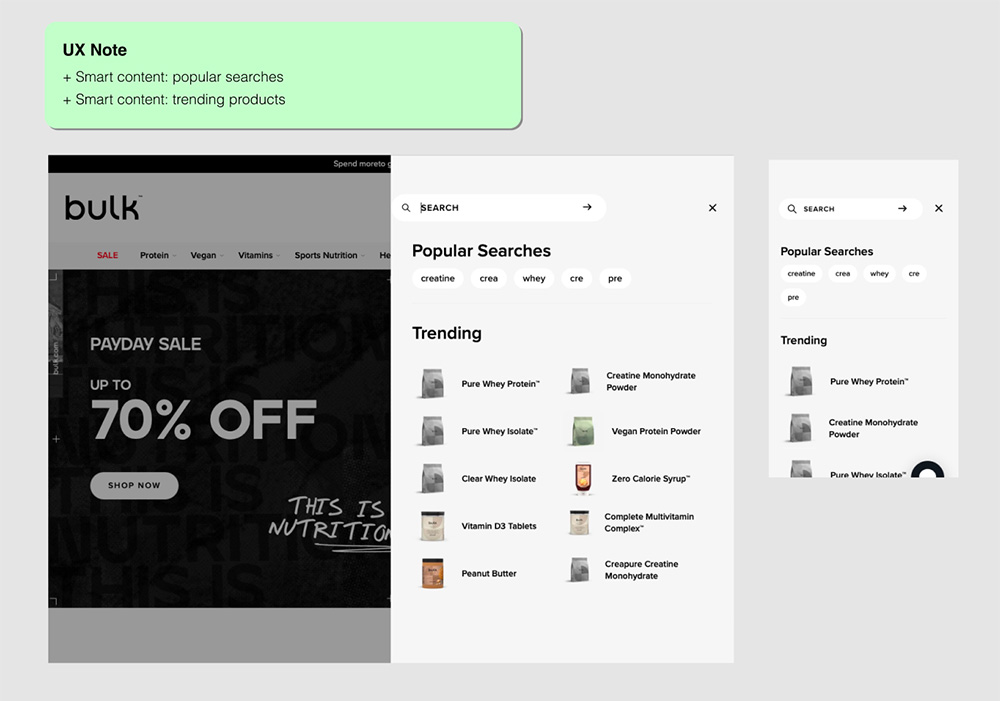
Search on bulk.com triggers an off-canvas nav system with popular/trending products

Reviewing these gave me a great sense of what could be possible in terms of


  1. Style
  2. Functionality
  3. Usability
  4. Affordance

Baymard Institute Recommendations


I cross referenced the findings from the above with examples from Baymard Institute. I’ve found this to be an invaluable resource for research as part of my Design Process.


In case you haven’t heard of Baymard before, they are leaders in UX reporting. Their UX articles and benchmarks are essential for discovering great (and not so great!) UX before starting work on early sketches or brainstorm sessions.

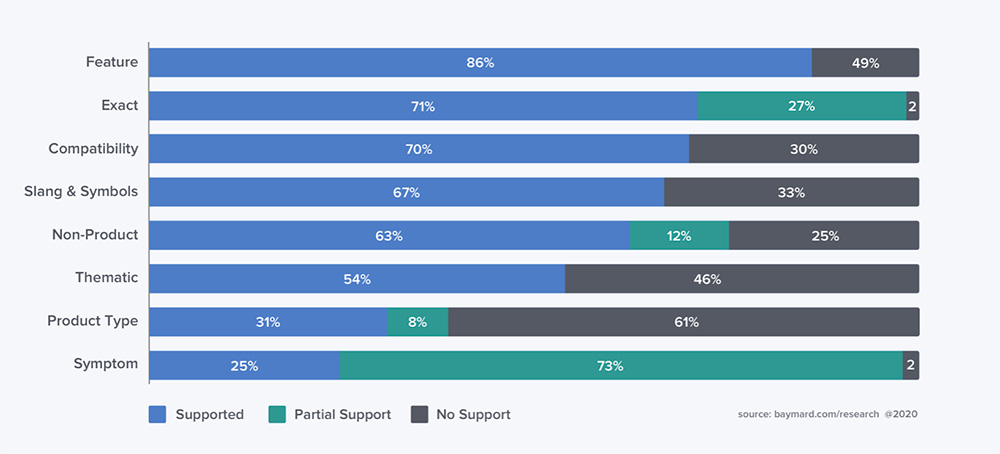
Baymard analysis of site search query types

DESIGN

I was of course already familiar with our brand and due to the time constraints I went directly into high fidelity design.


I actually find I can iterate high fidelity screens in Figma quite quickly in when a Design System is supporting the work. I can create new components and it’s easy to drop in existing components to support, which I can also detach and restyle if needed and then refine from there to create a variation or something new.


I create Auto Layout templates at specific screen sizes which makes structuring my screens fairly straightforward. Once there’s agreement around the direction, I tend to then formalise any new components by adding Auto Layout and merging into our Design System as needed.

Design Project Structure


I always try to make my designs as straightforward as possible to follow. This was especially important in this case as I was working closely with external developers and needed them to collaborate with me within the file.


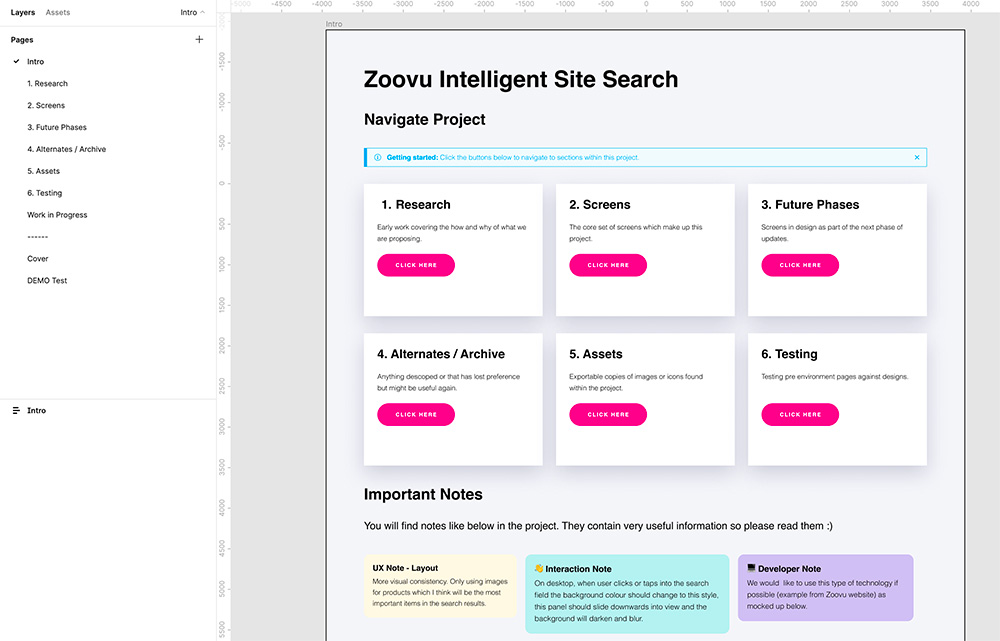
My first steps were to create a page structure and navigation system to make it easier for developers and stakeholders to navigate through the file.

Initial Designs


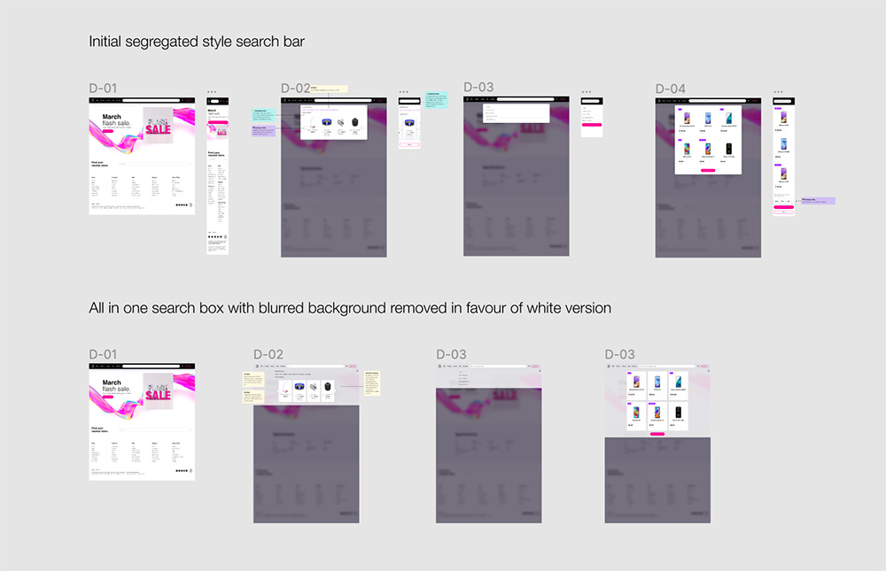
Below you can see some early designs. Many of these were influenced by my research.

Initial experiments and iterations

To look at one specific example. Here you can see a site header variation with a heavy level of contrast and full width search field.


This was designed with the intention of making the search bar much more prominent, similar to what we seen on Amazon.

Search bar with higher degree of contrast similar to Amazon

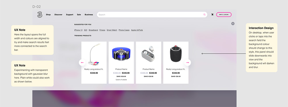
In a similar way, I experimented with different visual treatments for the expanded search bar and related content. Here some visual cues were inspired by Apple, such as the background transparency and blur. Some of the smart content suggestions were influenced by features I noticed within the Bulk and Nike search experiences.

Expanded iteration featuring background treatment and smart content suggestions

Final Designs


The final designs contained mainly stylistic changes and further refinements. I decided to reduce the impact of some of the cosmetic updates in order to preserve more of the existing Three brand identity and make the changes less harsh. Some features were stripped due to time constraints and went into a separate bucket for future versions of the product.

Global Site Header


This was a really exciting change as it would be appearing everywhere across our digital estate. The header is a core part of the CDN and is used on sister sites/subdomains as well as three.ie.

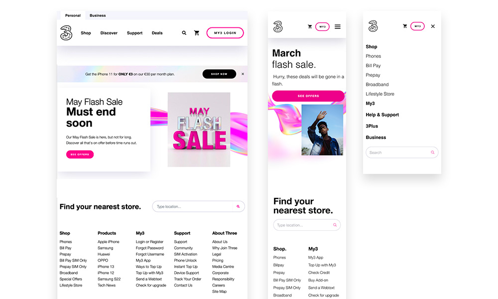
Before

After

As you can see, site search has become much more visually significant.


You may also notice how the experience differs on the tablet and mobile screens below. The search field is replaced by an icon to make the UI less cluttered. This is something I worked closely on with our internal developer.


I’m interested to review data comparing performance between the two approaches in the future, to see if users recognise the icon as well as the search field.

Final search bar on tablet and mobile

On mobile the Business CTA was moved into the primary navigation structure which solved a critical UX problem.

Expanded Search Bar


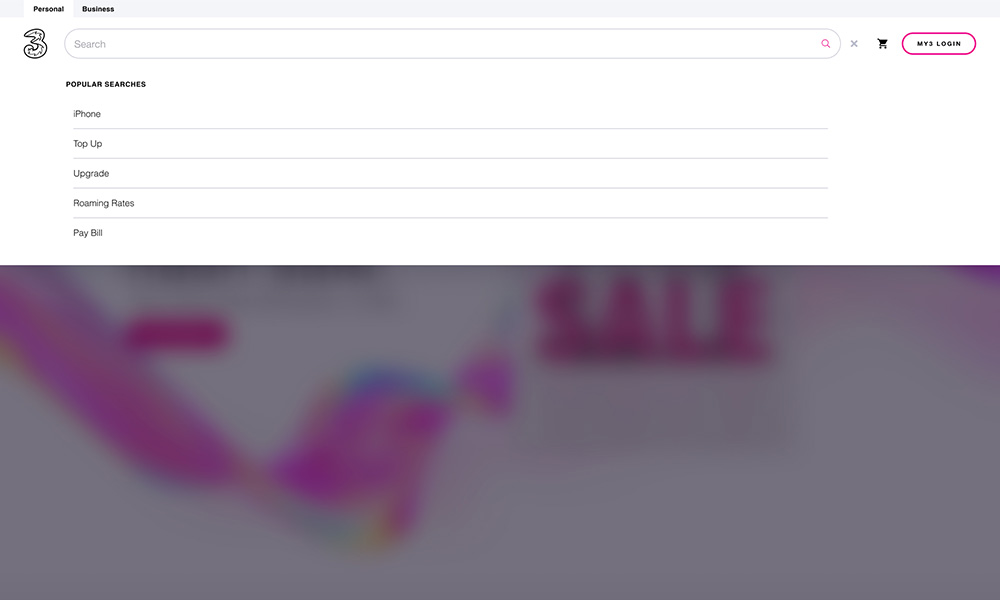
As the user interacts with the search bar it expands fluidly to open the initial search experience.


Here they are presented with a list of the most popular search terms.

Final expanded search bar on desktop

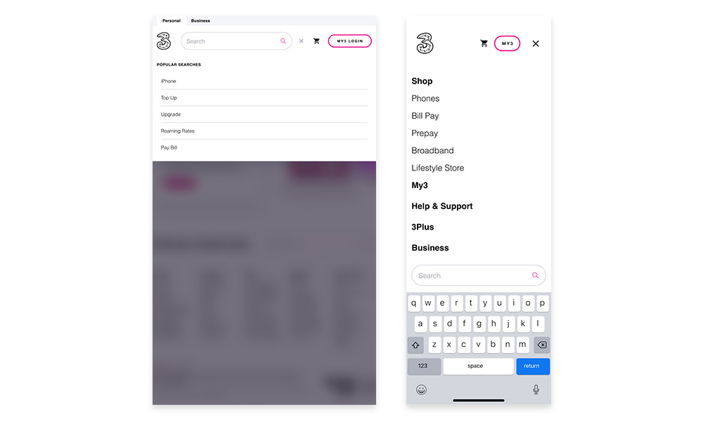
Final expanded search bar on tablet and mobile

The popular search terms were left out intentionally on mobile to avoid clashing with the primary navigation. It will be interesting to see how we can improve this in the future.

Search Results


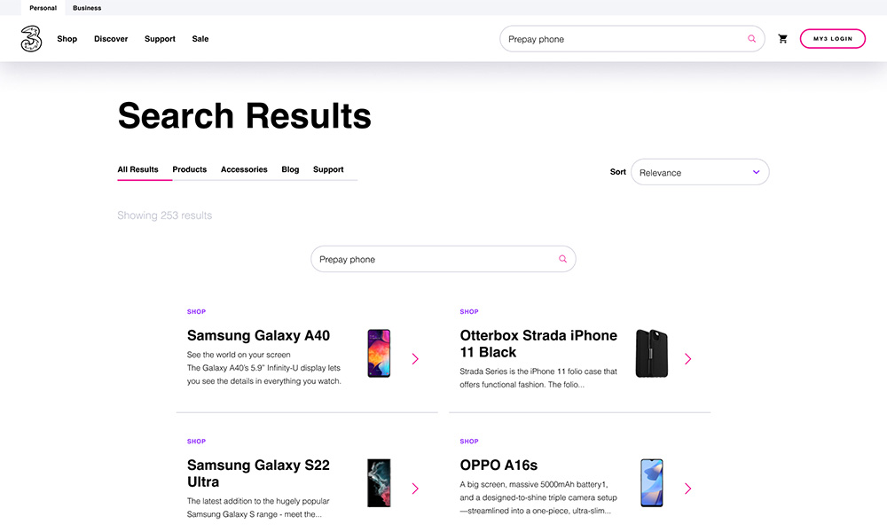
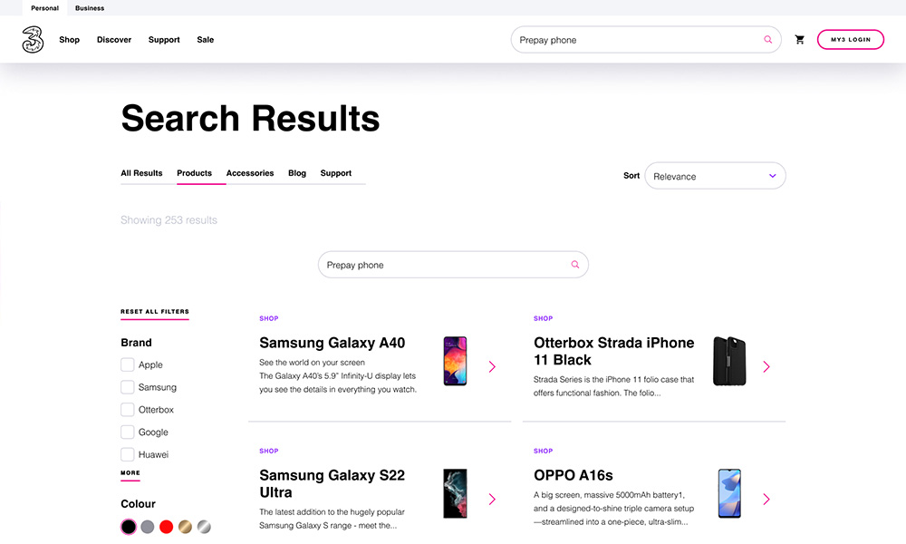
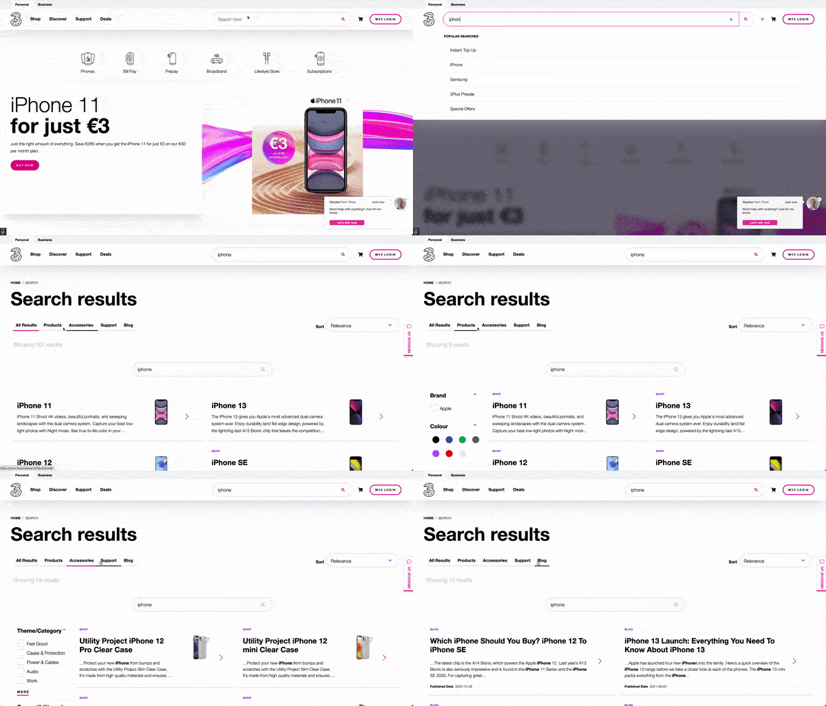
The search results page is where all of the results appear. This is split into various categories. There is also different functionality inside each. For example, the Products and Accessories sections each have unique filter sidebars which doesn’t appear in the other sections.


There are also other subtle differences. For example, Products and Accessories have thumbnails but other results don’t. This was an intentional decision to


  1. Ensure consistency by only having product style images appear
  2. Promote results which are product based

Search results page on desktop

Search results page for products with filter system active

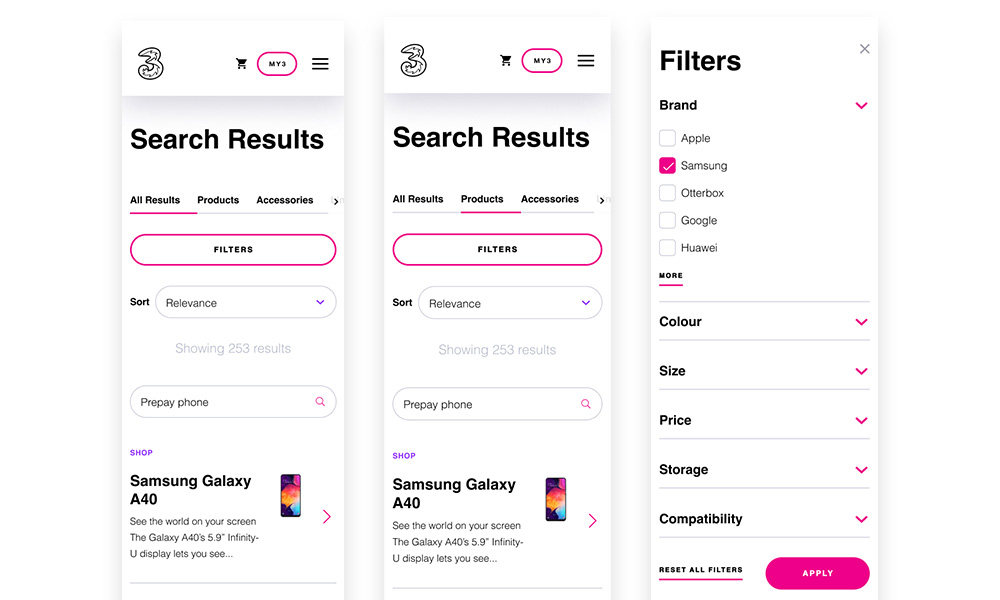
Here you can see how the the search filters become active in some sections. This is a powerful tool which allows the user to narrow results without actually being inside the main Shop experience.

Search results page on mobile with filtering

DEVELOPMENT & TESTING

As a Designer I consider my role to be continuous throughout the project lifecycle. Dev handover forms a huge part of that. As part of my day to day I work closely with developers, usually as part of Agile Squads, to assist in the distribution of assets, communication of solutions and ensuring design/functional consistency by testing the product thoroughly.

Component States & Micro Interactions


It was essential to provide clear information for the developers working on the project. I always enjoy working with external developers too because it gives me the opportunity to explain how the CDN and Design System works. I’m then able to guide them through using Figma to explore the designs. I find most external developers I interact with haven’t used it before so there is usually a good collaboration around this.
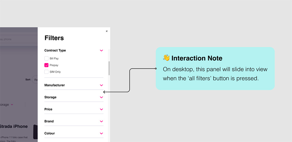
 

Below you can find some examples of the kind of extra information I provided with my designs to make them easier for a developer to understand and to try and provide extra information to supplement the core designs.

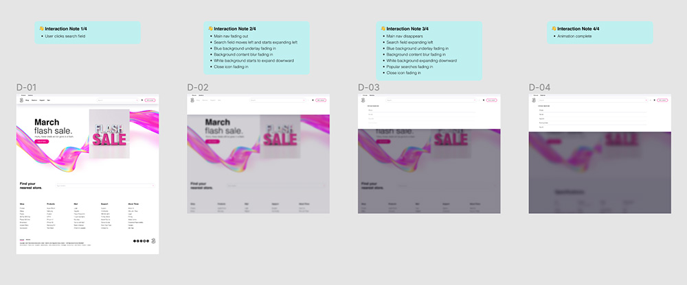
Micro interaction design for search expansion animation

The header expansion animation was a core part of the design so I created a micro interaction design to give the developer a deeper sense of how this should look and feel throughout the stages of expansion.

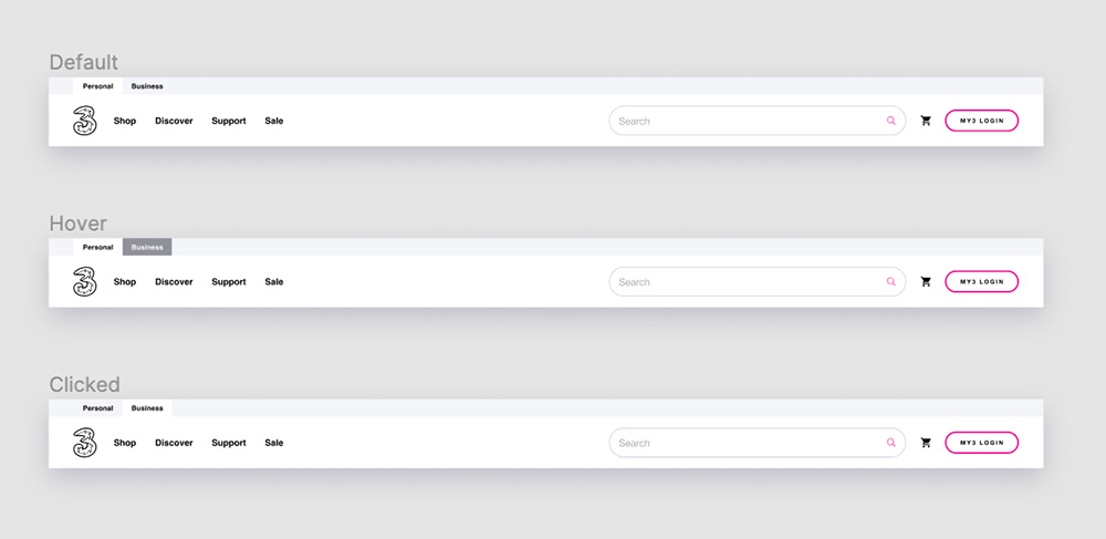
Example showing how a hover state should work for Personal/Business in the global header

Annotations


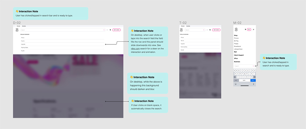
To clearly communicate how functionality and interactions/micro-interactions should work I annotate my screens. These usually cover user intent/action/result and try to remove any doubt for things which may not be visually obvious.

I made sure that my screens were thoroughly annotated for developers and stakeholders

Snag/Bug Tracking


A number of days were allocated for fixing design snags and bugs across desktop and mobile. From a design perspective I raised approximately 60 of these and all critical items were fixed before launch.

SUMMARY

I loved working on this project because it gave me a chance to improve a core part of the website for our users. There was an extra satisfaction because I know it had been neglected for many years. I think there is also an appreciation that much can still be done to improve it further.

It was exciting to launch something like this as a minimum product for day one with a view to making it an even richer, smarter experience in the near future. I also found the research into search and how it functions to be refreshing as this was a new area for me. It’s always fun to investigate how things like this work and discover some of the cutting edge technology being developed to make search systems smarter, especially when working with a group of experts on the development side. I feel there’s lots of value having learned about this as it will definitely be useful again in the future!